
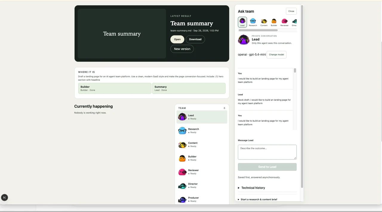
Dashboard
What is happening?
Manage the team: missions, results, approvals and who’s ready.
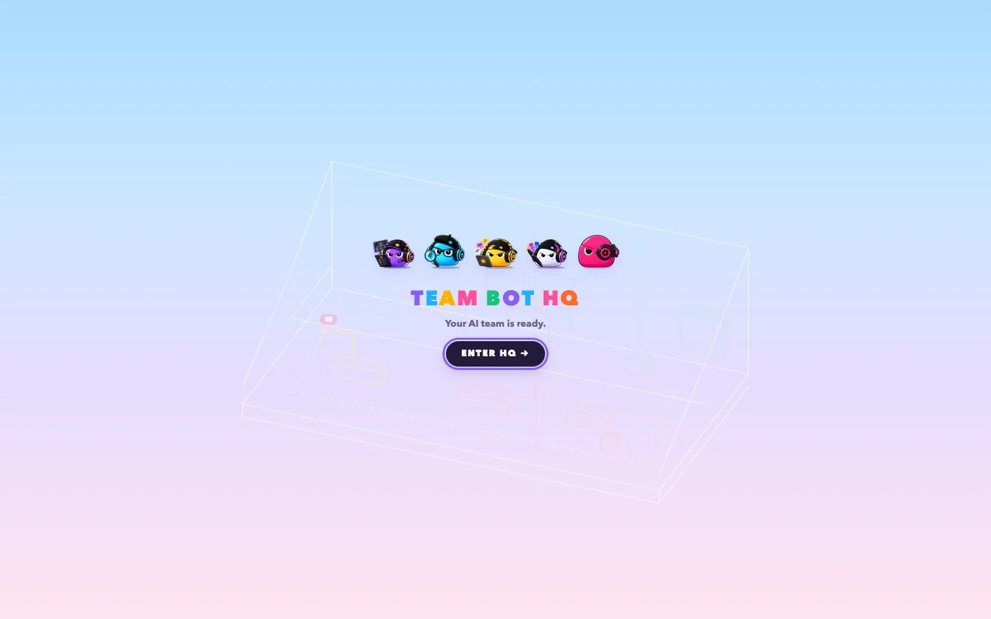
Watch your AI team work.
A playful 3D office that turns multi-agent orchestration — task handoffs, revisions and human approvals — into something you can understand just by watching.
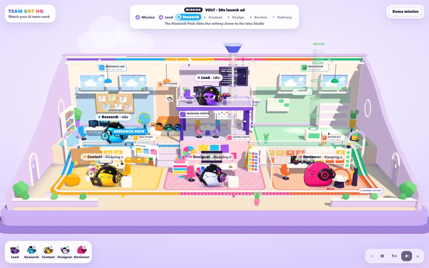
A normal agent dashboard tells you “Research — Complete.” Technically true. But it doesn't tell you what Research made, where it went, or why something came back.
As agents get more autonomous, seeing what's going on matters more, not less. I wanted TeamBot to feel less like watching background processes and more like supervising a creative team. Flip the view and see the difference.
TeamBot already had a Dashboard for running the work and an Agent Canvas for understanding the wiring. Neither one showed what it feels like when the team is actually working.
What is happening?
Missions, status, approvals and progress — managed directly.
How is it connected?
Agents, dependencies, decisions and handoffs as one system.
What does it feel like?
The same agents and workflow — as a living office you can watch.
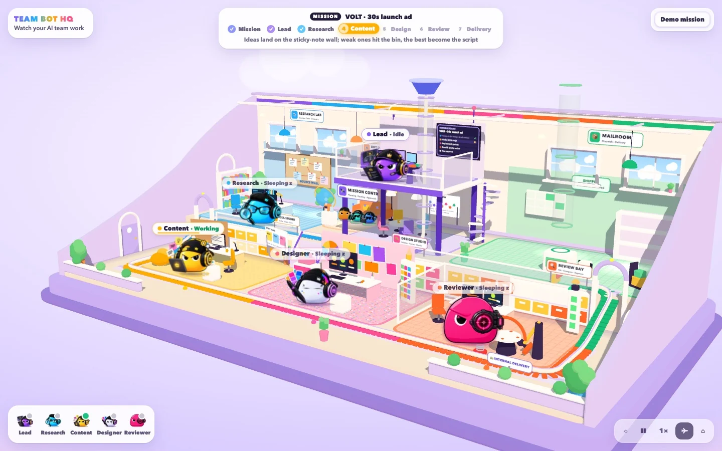
I turned my agent system into a tiny creative office. Each bot has a role, a desk and a personality. Missions walk in the door, tasks ride between departments, and when a human call is needed — the whole place stops and waits for you.
It's not just a 3D office. It's a spatial interface for agent orchestration.
Instead of adding more dashboards, I turned system state into space and motion. Six translations do most of the work. Scroll through them — each one starts as what the agent system actually says, then turns into what HQ shows. Flip any of them back.
agent_04 {
  role: "designer",
  state: "ready",
  pid: 48213
}
Hi! I do the visuals.
content.status = "idle"content.status = "task_received"content.status = "running" · 45%

 Research LabIdea Studio
12:04:31 handoff from: research to: content payload: research_pack.json content: waiting → running
DING!RES. PACKResearch LabIdea Studioreview.verdict = "revise"
reason: "punchier hook"
route_back: content ‹‹‹REVISEIdea StudioReview Bay
delivery.awaiting_approval = true blocking: ["delivery"] owner: human
HQ wasn’t where TeamBot started. It started as forms, logs and JSON, and each iteration moved one step closer to showing the team instead of describing it. Dates and quotes come from my project notes and commits at the time.
The first TeamBot was functional scaffolding: a private conversation with Lead, a list of runs and an audit log. By Stage 3 a team of agents could run a whole (mock) campaign — and the page reported it as plain text: “research-agent: growth-research — completed”.
Functional acceptance scaffolding rather than an Agent Canvas … Every block currently receives equal visual weight.
My Stage 5A interface audit · Sep 11
Next decision Build a real team workspace — but keep it quiet: “avatars are identifiers and status affordances, not decoration” and “Animation: absent by default.”
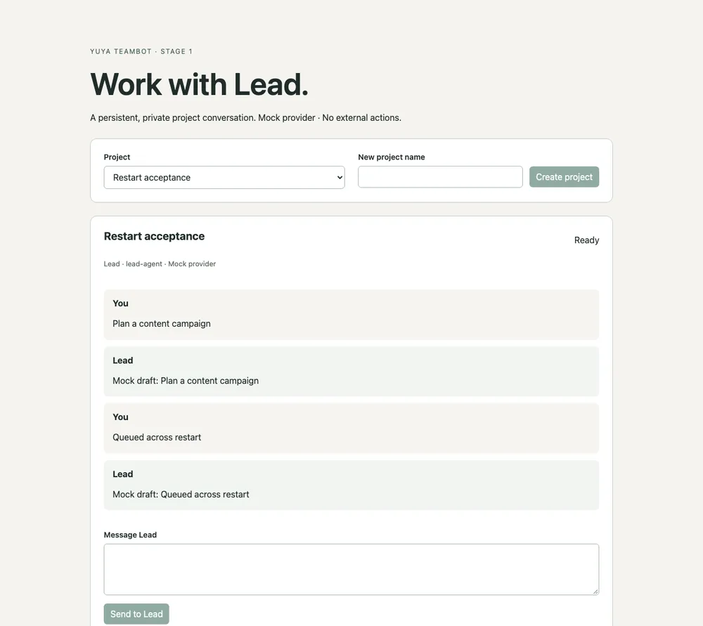
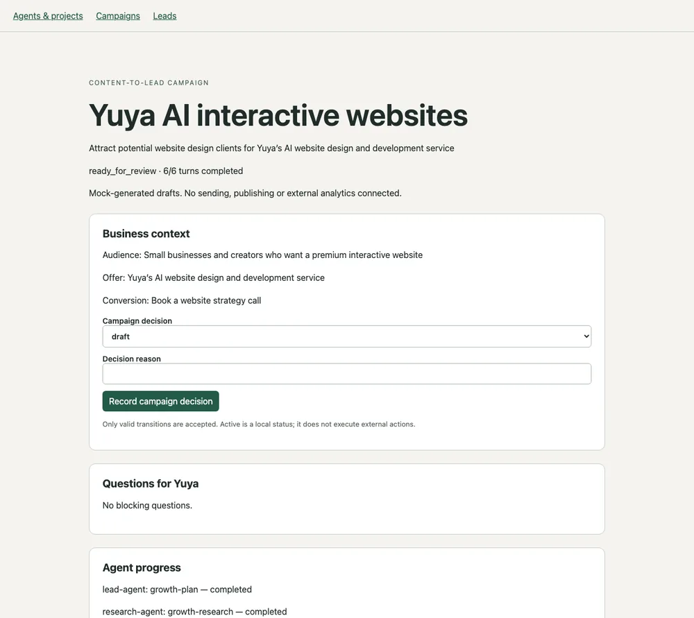
The bots joined the product as identifiers: a team roster, an Agent Canvas of character cards, a Control Room for keyboard triage and a Studio home built around “What do you want to create?”. The rule for every view was honesty.
No invented states. Unknown values are hidden, never shown as zero.
Studio redesign plan · Sep 30
Decision Defer the animated office. “Decide on the real-provider milestone before completing cosmetic work so the product does not end as a polished mock demo.” — next build plan, Sep 28
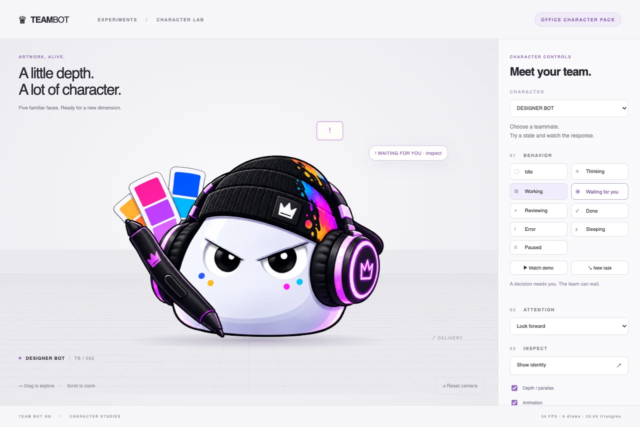
The next step happened outside the product, in a character lab. Instead of remodelling the bots as full 3D characters, each one became a shallow 2.5D relief built from its original illustration, with a small language of readable micro-states.
Shallow illustrated characters, not full 360° models or GLB files.
Character pack README · v1.2
Trade-off The illustration survives intact, but the camera has to stay within about ±12° — no backs, no rigs. Measured in the lab: one bot at 60.3 fps, ten copies of a shared asset at 60.1 fps (desktop, synthetic load). In v1.2, Sleeping and Paused were removed: idle bots stay awake.
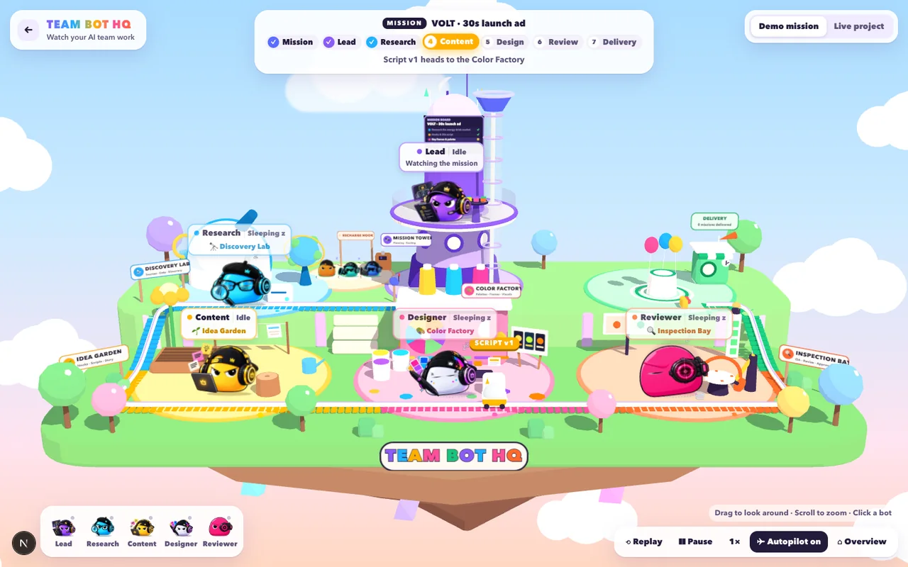
The first HQ was a floating island with whimsical zones. The next layout became a cutaway office — a dollhouse on a display plinth — and every room was renamed after the job done inside it.
70% playful office, 30% bot world … the near wall fades like a real dollhouse, so it never hides a department.
Team Bot HQ notes & README
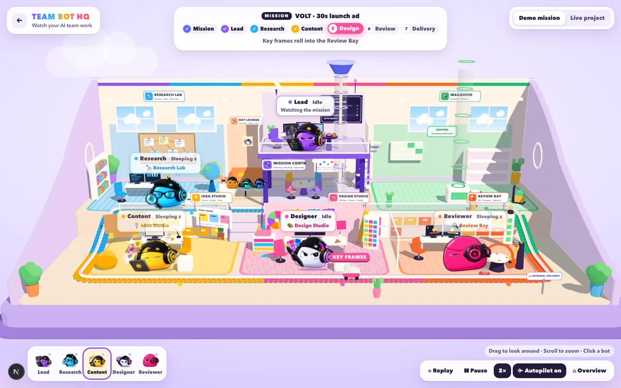
A final depth-and-hierarchy pass and an entrance sequence, then a deliberate stop. After the lock, HQ moved into its own standalone site, gained cutaway side walls and a Live project mode that mirrors a real TeamBot project.
Feature lock: Team Bot HQ V1 is feature-complete.
Team Bot HQ notes
Constraint Depth without extra cost: “baked gradient decals (no extra lights or shadow maps)”.
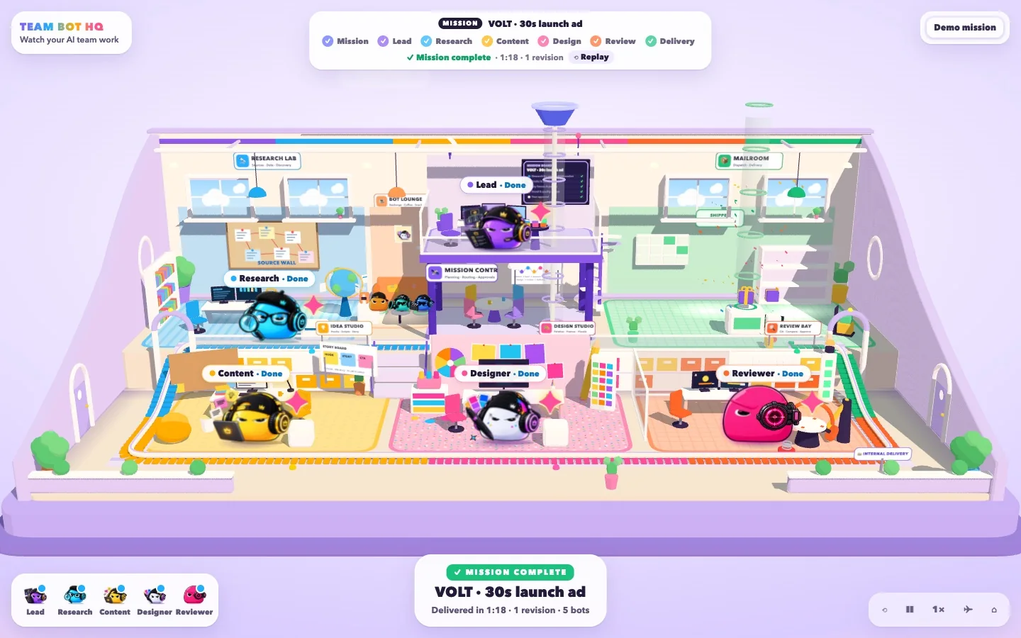
What stayed constant: honest state — mock work labelled as mock, unknown values hidden. What changed: how much of the team you can see at a glance.
Every bot has its own identity — not five recolors of the same agent. Tap one to open its ID card, the same card you'd see in HQ. The bot stays recognizable across the Dashboard, the Canvas and HQ.
No expensive humanoid animation. Just a small language of micro-states that anyone can read. These are the real 2.5D office characters — pick a bot, try each state, and drag to look around.
My Yuya Film Studio is cinematic and moody. TeamBot needed a totally different personality — bright department colors, rounded architecture, toy-like proportions and lots of little details.
First“These bots are adorable.”
Then“Wait, they have their own office?”
Finally“…they're actually working.”
Instead of a status silently flipping from “Complete” to “Working,” the work physically travels. A Research Pack leaves the lab, rides the railway, Content spots it coming and gets to work. Run the mission — then try a revision.
When Reviewer says REVISE, the task doesn't vanish and magically reappear. The cart reverses. The direction of movement is the feedback loop.
Review → “Punchier hook” → ← Content → revises → Design → Review
Review → “Bolder colors” → ← Design → revises → Review
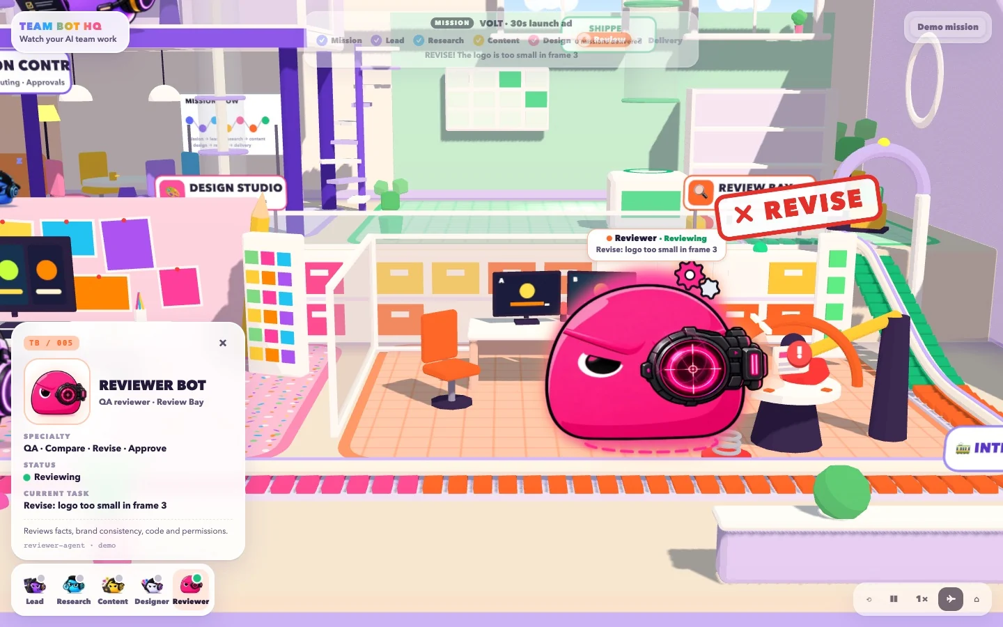
Each environment shows the bot's specialty, so you can tell what's happening even from across the office.
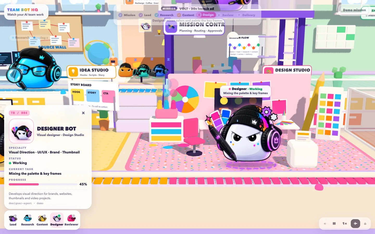
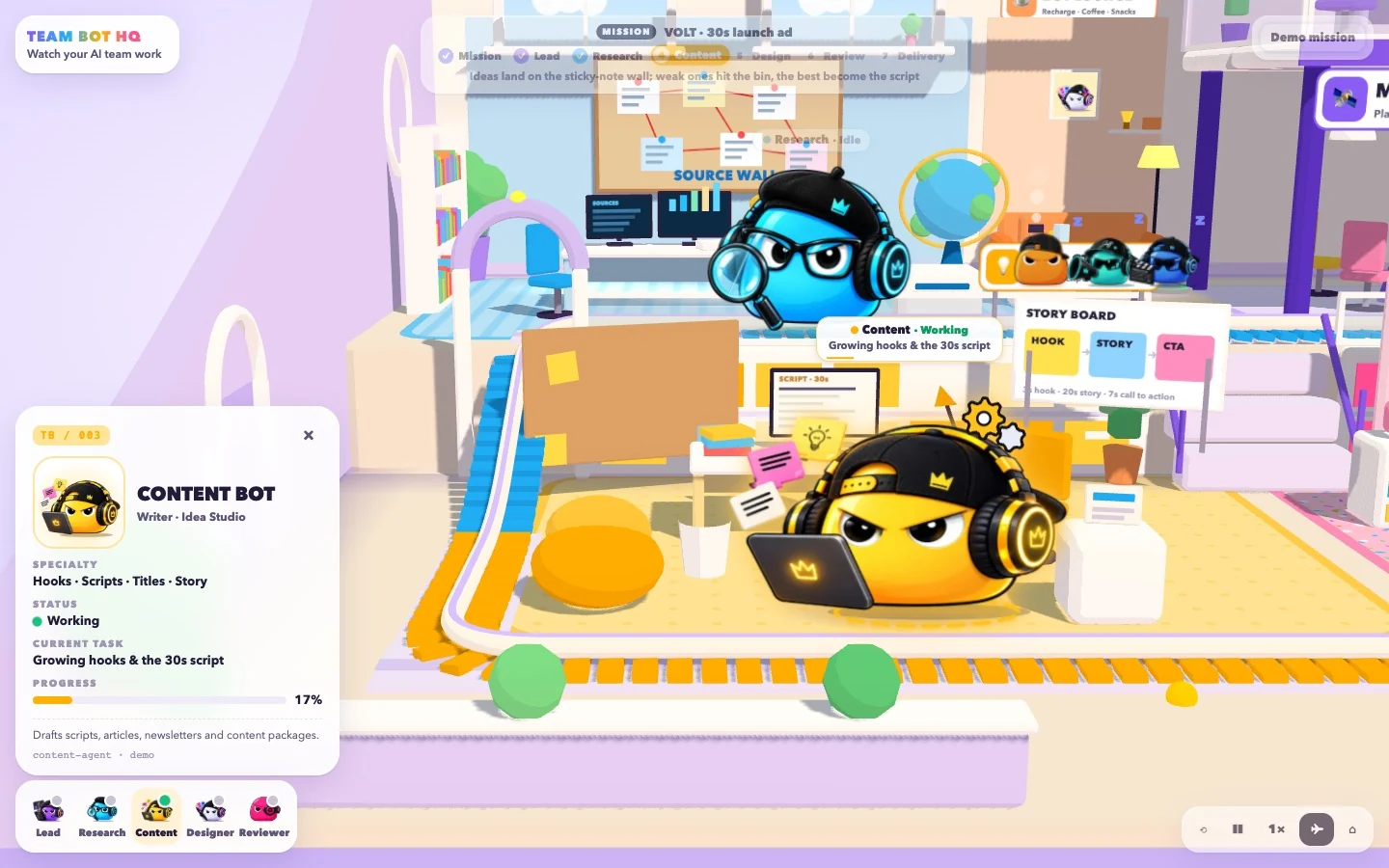
I skipped WASD on purpose. HQ uses a constrained dollhouse camera so several bots stay visible at once — because this project is about collaboration, not exploration. Try it: drag to pan, zoom, or tap a bot to focus.
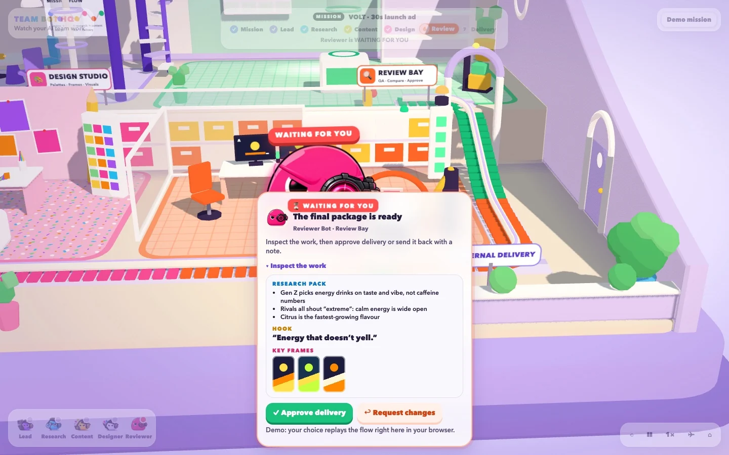
When Reviewer hits a call that needs judgment, the whole workflow stops and waits for you — inside the same visible flow, not as a pop-up interruption. When you reach the package, the page waits with it. It's your turn: inspect the work and decide.
TeamBot HQ didn’t replace the Dashboard or the Agent Canvas. It became the third way of looking at the same agents, tasks and handoffs. Not every complex system needs one universal interface — sometimes the same system is easier to understand from a few different angles.
What is happening?
Manage the team: missions, results, approvals and who’s ready.
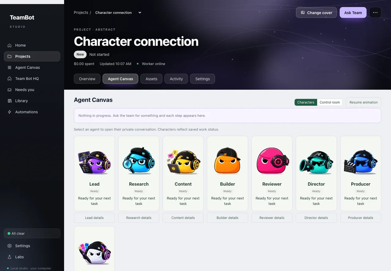
How is it connected?
Understand orchestration: every agent, its saved work status and its private conversation.
What does it feel like?
Watch the team work: handoffs, revisions and approvals as movement.
Bots idle and glance around. Tasks arrive. Workstations light up. Bots glance at each other during handoffs. You can step in whenever you want — but the system makes sense just by watching. HQ runs in two modes.
A replayable story that explains TeamBot with zero setup: mission enters → Lead plans → Research → Content → Design → Review → maybe a revision → your approval → Delivery. Pause it, replay it, speed it up — or put it on autopilot.
Onboarding · portfolio · recordingHQ mirrors a real TeamBot project. The characters and workspaces reflect real agent activity — so it's never a disconnected animated toy. It's another view of the same system.
Real agents · real tasksThe demo mission — VOLT, a 30-second launch ad — goes from plan to research, script, frames, review, your approval and delivery.
Lots of characters, see-through layers, animated desks, carts, labels and shadows all fight for the same frame budget. The goal wasn’t to make the world simpler — it was to make it cheaper to run while keeping its charm.
Ten copies added nine draw calls and held 60 fps. The test’s own caveat: a synthetic same-artwork desktop load — not a full-office or mobile benchmark.
Built to a budget
The most interesting outcome wasn’t the 3D office. It was how much of a multi-agent architecture can be explained by watching instead of reading. My design goal was that a non-technical visitor could understand the system in about thirty seconds — that’s a goal, not a tested result yet, and it’s the next thing to prove with real people.
Four principles for AI-native interfaces
Every view follows the same rule: no invented states, unknown values hidden rather than shown as zero. HQ is a projection — it never writes runtime state.
Managing, understanding and watching are different jobs. Dashboard, Agent Canvas and HQ each answer one question about the same agents.
Approval isn’t a pop-up. The workflow visibly stops at Reviewer and waits — and nothing in HQ can approve on your behalf.
I deliberately deferred the animated office while the real system came together, so the delight sits on top of real behaviour instead of a polished mock.
What should interfaces look like when software isn't a set of tools anymore — but a team of autonomous actors?
TeamBot HQ is one answer I'm exploring.
TeamBot HQ is a spatial interface for TeamBot: a playful 3D office that turns multi-agent orchestration into visible task handoffs, revisions and human approval points.
Five specialist bots represent Lead, Research, Content, Design and Review. Task packages travel between departments on a railway; revisions move backward and delivery waits for human approval.
HQ is a projection of system state. Demo mode illustrates a mission; Live mode mirrors a real TeamBot project. HQ does not write runtime state or approve work on the user’s behalf.
The character lab measured 60.3 fps for one bot and 60.1 fps for ten copies of one shared asset on desktop Chromium. These are synthetic character tests, not full-office or mobile benchmarks. Understanding the system in thirty seconds remains a design goal awaiting user testing.